M-commerce and mobile commerce have been around for a long time, and it’s time to prepare for them. As an e-store owner or an affiliate marketer, you absolutely need to be mobile-friendly. Otherwise, you will miss out on many customers and sales.
But how do you do that?
This article explains what you should pay attention to when optimizing an e-shop for mobile commerce.
What is m-commerce, and why is it important?
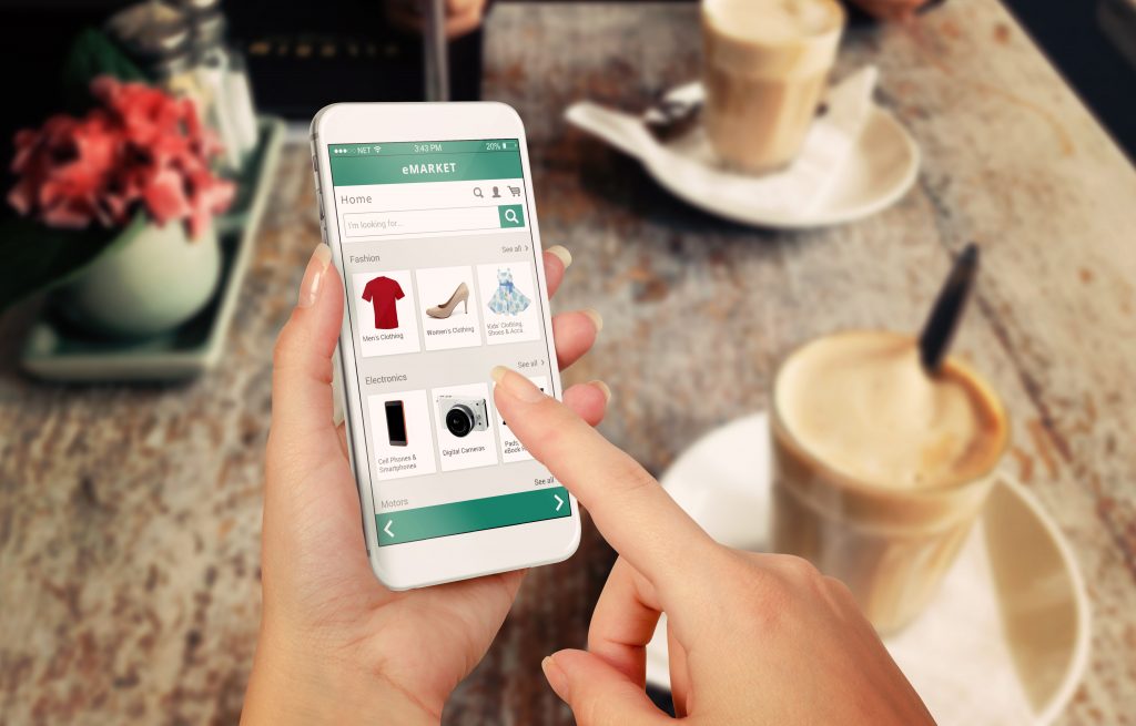
Simply put, m-commerce is a blend of mobile and e-commerce; it is basically “shopping on a smartphone.”

It can include a variety of activities, from ordering groceries online to banking transactions wired through an app.
The fact that m-commerce is going to conquer the world of online shopping was announced a few years ago, and every year, the number of purchases via smartphone is growing dramatically.
If an e-shop’s performance does not necessarily show a high conversion rate via mobile devices, this is probably not a sign of disinterest in this way of shopping. More often, it’s about the lack of user-friendliness on the mobile version of that particular online store.
Perhaps, smartphone users’ user experience (UX) leaves much room for improvement and lowers the conversion.
Tips for optimizing your online store for m-commerce
Whether you have been running a successful online store for years or thinking about starting an online e-shop this year, m-commerce is of great importance to everyone.

What should you consider when optimizing a web store for mobile?
First Impression
What is the first thing that a potential customer who first lands in your online store sees? As with the site’s desktop version, make sure the site’s value statement is instantly clear.
What do you stand for, what do you sell, and why should your customer even click further?
If the visitor arrives from an email or special link, make sure you have a good landing page. In one of our previous posts, we have already covered the importance of a landing page.
Mobile Friendly
It may seem obvious, but it is still something many e-commerce sites still miss; is the site mobile-friendly or ready for small screens?
This often means responsive design (something that most online shopping software platforms have fortunately already thought of) or even their own app, whereby the content always adapts optimally to the screen on which it is displayed.
Think Visually
Keep in mind the limited screen size of smartphones when designing your mobile version of e-shop pages. Go for large buttons, preferably as wide as the page. Use a readable font and size, and try not to cram too much on a screen.
Up to two product or blog posts in a row is often optimal, assuming you first show the photo and then display the article name.
The Thumb Zone
The ‘thumb zone’ refers to the area on the screen that is easy to reach with the thumb.
If the navigation is far away from the thumb zone and located at the top of the screen, it is often difficult to “click” on a smart device.
Make sure you don’t inconvenience your customers and keep the most important buttons within the ‘thumb range.’ The simpler you make it for your customers to click through to the final phase of the purchase, the better.
Touchscreen
Online shoppers on a smartphone can expect to use the typical functionalities of the mobile device on your site. This mainly refers to the option to zoom in via pinching and to swipe through images.
If your site’s functionality is “revolutionarily different,” you will not get extra points for creativity, and you will lose your customer.
Help the Customer
By keeping the pages clean and simple, you can help the customer continue their customer journey.
What is the next step in the buying process?
Avoid unnecessary clicks, use a breadcrumb to show visitors where he is right now, and make sure they can always go back or take a look further.
Avoid Complicated Fields
Many online shoppers often drop out when they see an extended form to fill out.
Keep this step as simple as possible (and turn off autocorrect for fields such as address and last name). Collect an email address first without overwhelming the customer with 20 fields, out of which 19 are mandatory.
Should the customer be distracted by an incoming app or just click away, you can always send them a friendly reminder about their abandoned shopping cart via email.
Payment
If your customers have finally reached the checkout step, make sure you don’t lose them here either.
Provide a clear overview of the shopping cart, make sure that it is also customizable (remove items, for example), clearly display delivery costs and information, and finally, offer as many payment options as possible.

If you are not a local business, consider possible foreign buyers and the payment methods they would like.
Depending on your target audience and business niche, cryptocurrency can also be considered.
Using an Affiliate Marketing Software
You may not even know if your goods or affiliate products are selling on mobile phones better than on desktops. If your e-shop consists of affiliated products, you may want to use affiliate tracking software to track, analyze, and optimize your sales. Affiliate marketing software will allow you to see where and why your customers drop out, which traffic source converts best, and, most importantly – analyze your mobile shoppers’ performance.
Keep Tweaking
Once you have made a big step in optimizing for m-commerce, do not stop here. This will be a constant process, always aiming to provide the most friendly shopping experience on a mobile device. Do user research, keep testing, and keep up with affiliate marketing trends in 2021.
M-Commerce – Conclusion
Optimizing your e-shop for mobile devices is no longer a fancy term only a selected few would consider. That’s the new norm. People shop on their mobile phones out of boredom, because of privacy concerns, before going to sleep, or just because their mobile screen resolution is better than their PCs. This allows us to examine product photos more closely and carefully. Anyway, you are going to look at it,
Last Updated on July 11, 2023


